In a digital world overflowing with static presentations and linear slideshows, designers are increasingly turning to interactive content to stand out. Whether you’re building customer experiences, product stories, onboarding flows, or immersive brand narratives, interactive content gives you the ability to guide users through dynamic, choice-driven journeys, not just pages.
For Figma and Canva designers, this shift opens up exciting creative possibilities, but it also requires thoughtful structure and intentional experience design.
Below are the top 10 best practices to help you design polished, intuitive, and highly engaging interactive experiences, no matter which tool you start in. Watch each best practice come to life by pressing play to see real examples in action.
Your cover page should instantly signal to viewers that they’re not looking at a standard deck or static PDF. This is your chance to set expectations and create curiosity. What works:
Think of the cover page as a “digital welcome mat.” You’re not just presenting information, you’re inviting someone into an experience that says: this is something special.
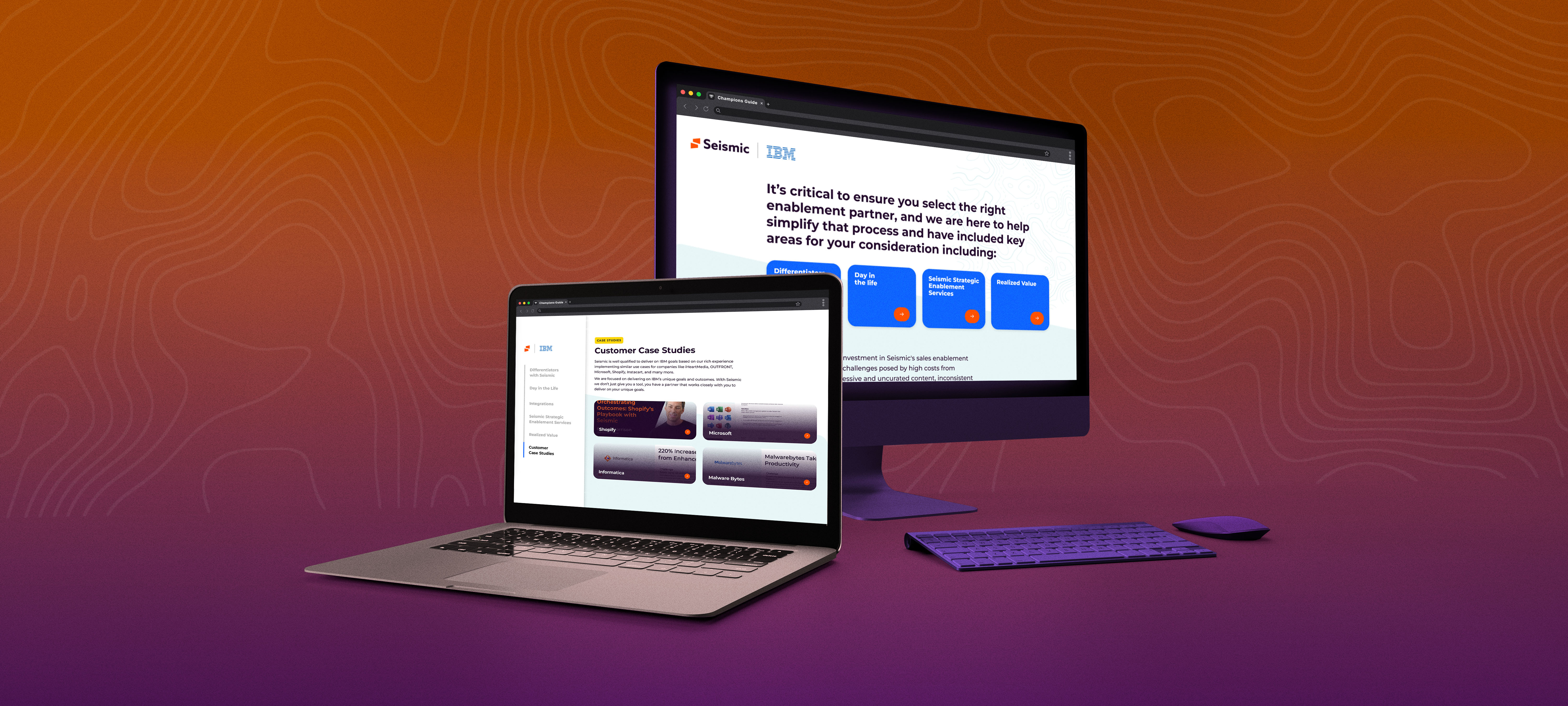
Once you move beyond linear slides, viewers need a clear way to understand the content structure and navigate freely.
A menu page or table of contents acts as a home base viewers can return to at any time. It provides:
Design this page as a central hub, not an afterthought. In your Figma or Canva file, this often becomes the frame you reference most.
Just like websites have a persistent header, your interactive content needs consistent navigation across every screen. Include:
Users should always know where they are and where they can go next. If you’re designing in Figma, think about creating components you can reuse across frames, it keeps your file organized and your experience consistent.
Design cues that invite exploration without requiring viewers to hunt for next steps. Consider:
Your goal is frictionless movement that feels natural and discoverable, not like solving a puzzle.
When viewers know where they are in the journey, they’re more likely to keep exploring.
Examples:
This is a small detail that makes a big difference. It’s the difference between “I think I’m here?” and “I know exactly where I am.”
Interactive content must feel excellent on desktop, tablet, and mobile. That means responsive thinking from the start, not at the end.
Make sure:
If you’re designing in Figma, consider setting up frames for multiple breakpoints early in your design process. It’ll save you time later and ensure your experience translates beautifully everywhere.
Unlike traditional slides, interactive content can feel spatial, not flat. You can create experiences where users dive deeper into specific topics without losing their place in the broader narrative.
Use depth intentionally by designing:
This creates a richer, more immersive story where viewers can explore at their own pace. Some people want the high-level overview, while others want every detail. Interactive content lets you serve both without compromise.
Visual richness should never slow down the experience. A beautiful design that takes too long to load won't get seen, viewers will click away.
Best practices include:
Think of performance as part of the design. A fast experience protects all the hard work you put into making it beautiful.
Even the most beautifully interactive experiences benefit from an accompanying downloadable PDF or static version.
This gives viewers:
Include it in a menu or footer for easy access. You’ve already done the design work, repurposing it as a static backup takes minimal effort and adds real value.
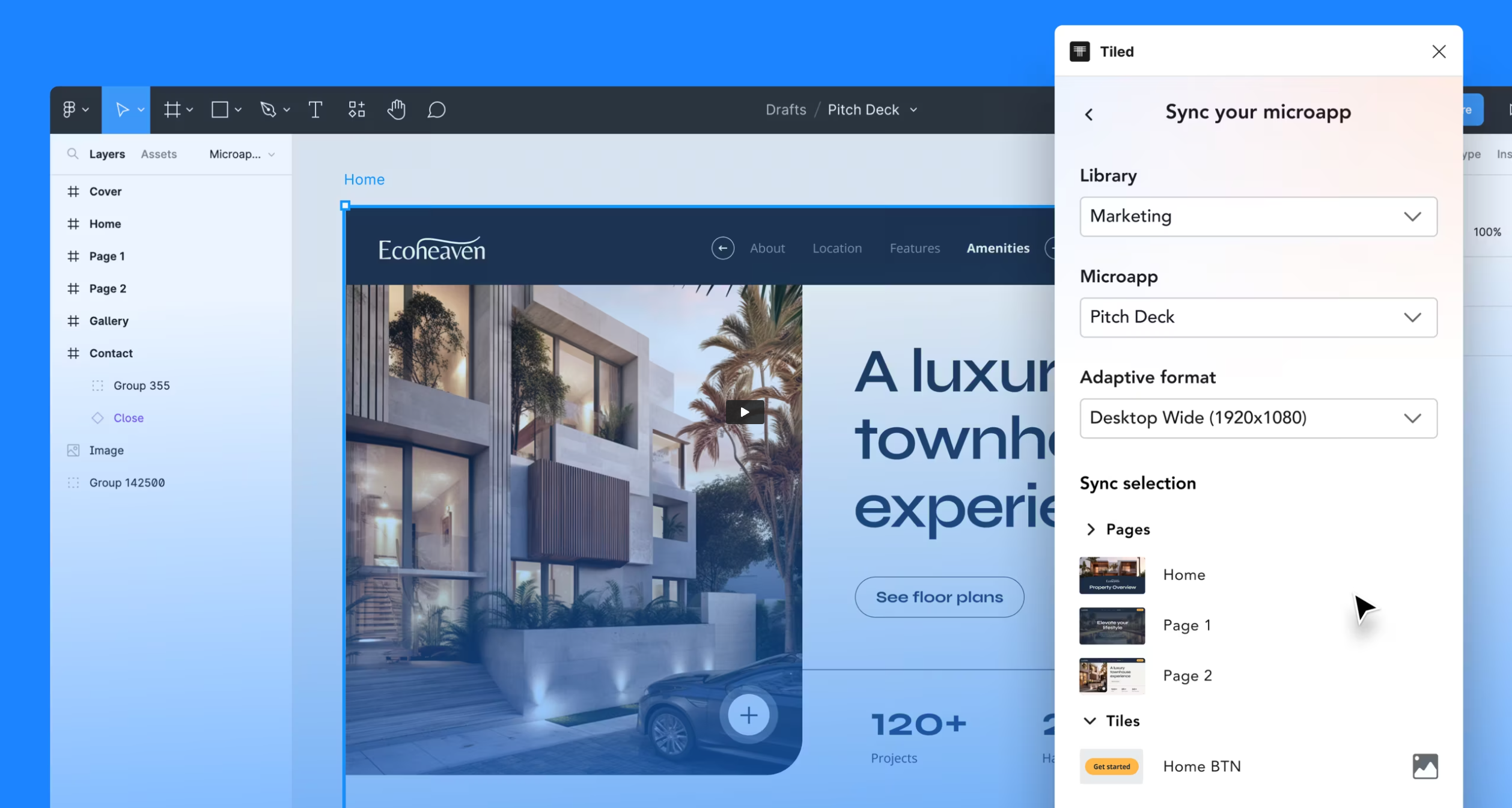
One of the biggest advantages of interactive content is the ability to tailor experiences for different audiences without rebuilding everything from scratch.
Design with placeholders or modular components that can be easily updated for
In Figma, this might mean using components within variants. In Canva, it could be setting up templates with swappable elements, The key is building flexibility into your design systems so customization doesn’t require starting over.
Small touches (like personalized greetings or role-specific paths) can dramatically increase relevance and engagement. Instead of creating just one experience, you’re creating a framework that can adapt.
Interactive content is no longer “nice to have." It's quickly becoming one of the most compelling ways to communicate, persuade, and educate. For designers, this shift toward interactivity unlocks creative freedom, but it also requires thinking beyond the static frame, considering user flow, thoughtful UX decisions, and how people will move through your work to ensure your experience feels intuitive and memorable.
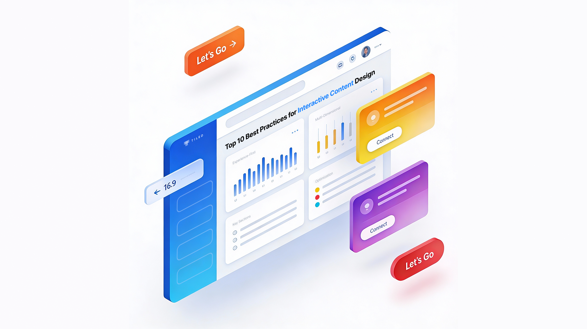
The good news? You don’t need to become a developer. If you’re ready to turn your layouts into a fully interactive, dynamic experience without learning code, platforms like Tiled make it seamless. You can design in the tools you already use, then bring your work to life with responsive layouts, navigation logic, personalization, and rich interactivity.
Ready to elevate your interactive content? Bring your design into Tiled and transform it into an immersive microapp experience.