One of the core principles of good UX design is that a user should never feel lost. At all times, a user should know their location within a website, app, or other experience. If someone ever says, “How do I get back?” you know you’ve got more work to do.
With Tiled, this principle has never been more true. Tiled allows designers to create totally custom interactive experiences with ease. No templates. No coding.
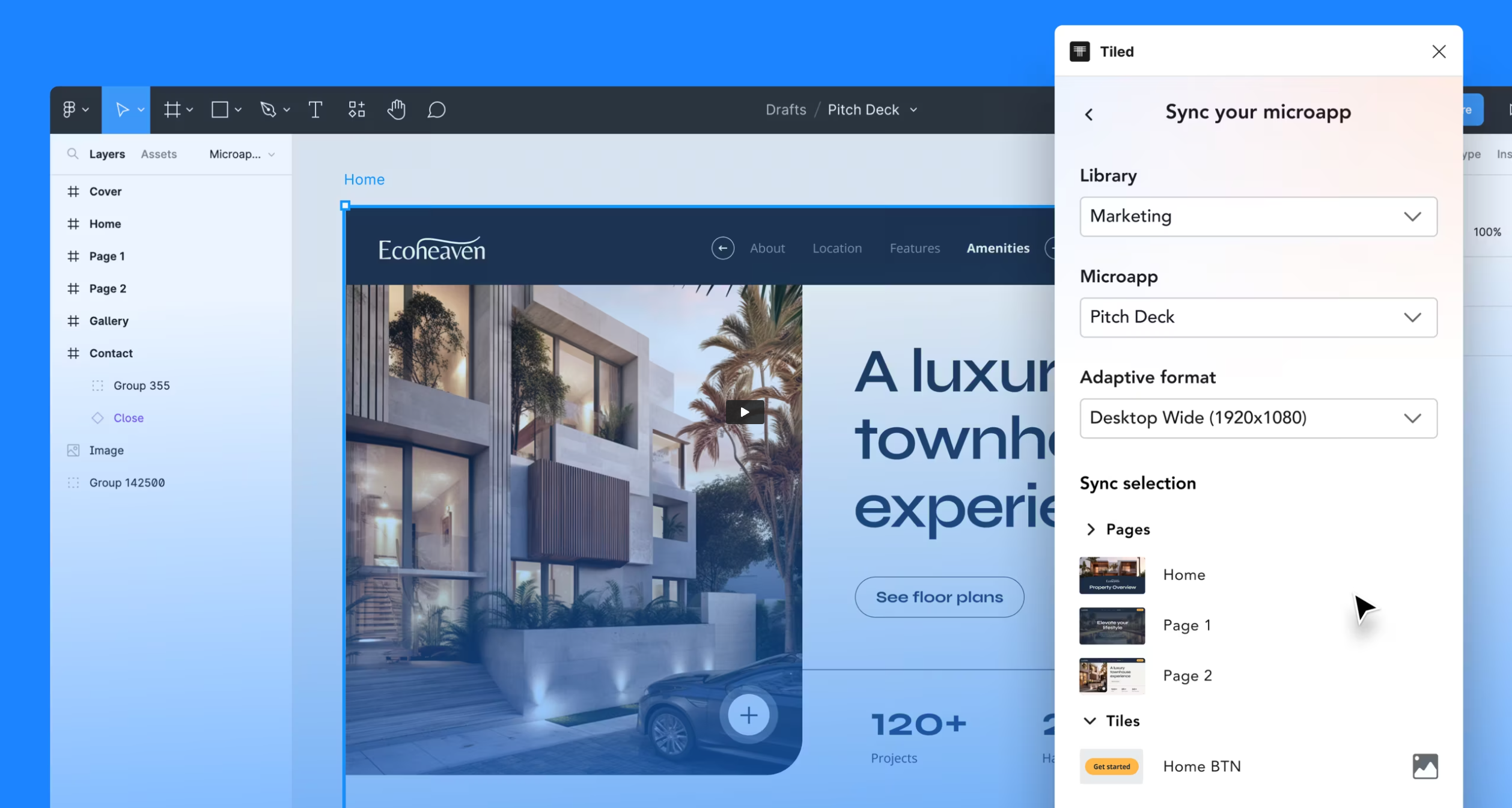
This post will take you through 2 key features of effective Tiled campaigns: the Landing page and Navigation.
Landing Page
A good landing page is a welcome addition to any Tiled campaign. Thrusting a user straight into your experience can be jarring, so it helps to have a page to help them acclimate to the experience you’ve created.
The content of a Tiled landing page can vary. It can function similar to a hero-section on a website — a brief introduction of the organization or product, with a call-to-action to visit the next page. Alternatively, a landing page can act as an immediate navigation portal into the various sections of your campaign. As a designer, one of the greatest elements of building a Tiled campaign is the freedom it gives you to create a completely custom experience from the ground up.

Navigation
Potentially the most important element of any Tiled campaign is its navigation. A user’s ability to orient themselves within your experience is vital to the success of a campaign. Your navigation should be ever-present and visually descriptive — someone should be able to understand exactly where in your campaign they are at any point.
Designing an effective navigation for a Tiled campaign is no different than designing one for a website or app. It’s crucial that, if you decide to use an always-visible universal navigation, it’s on every page, and doesn’t change throughout the campaign. Alternatively, if you decide on a nav that is hidden by default behind a hamburger icon, it should behave the same way on every page.
A crucial part of any navigation is its active-state. This tells the user what page is currently being shown, and can be denoted by color, opacity, etc. Your active state is also an interesting way to inject your brand into the campaign. This is another example of why designing for Tiled can be so enjoyable: it’s a platform that allows you to build however you want.

Conclusion
These are only two design principles of many that you can keep in mind as you design for Tiled. Above all, think about the high-level experience: what does this feel like to someone who’s never seen it before? Will they immediately be able to understand where to go? If you can design user-first and focus on the overall experience, your experiences will be much more effective at distributing content to your users.
-Tanner Thelin, Designer for Tiled